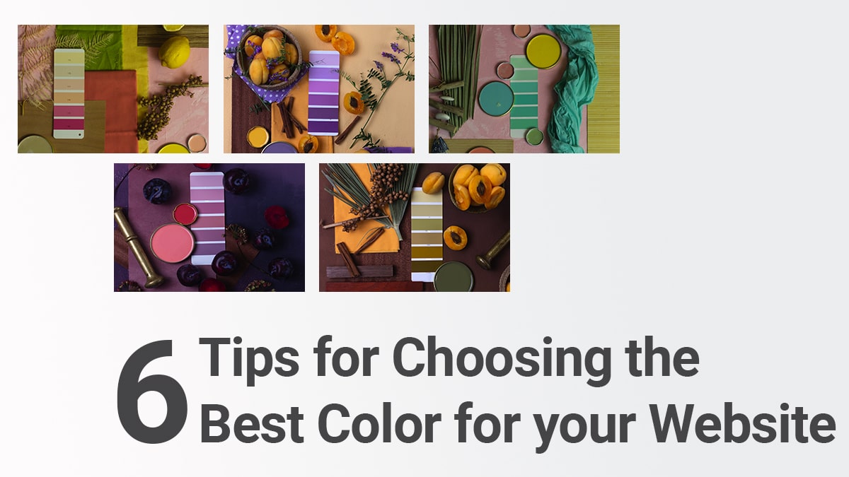
Website color not only adds visual attractiveness to your website but also plays an important role in influencing your customers.
Human eyes can see 10 million different colors and using this we can perceive the world. Colors can influence our brain in perceiving certain emotions and as a designer, you can exploit this behavior of the brain to make your customer do what you want to do.
For every business, creating a product is just 30% of work but, to package, market, and generate sale is the rest 70%. So, it becomes essential for you to create a design solution for your brand as well.
A website design can stand out from every other competitor of yours if you have a good UX design with a good color choice.
Usually, every website design has a scheme of colors combination that complements each other visually. In this article, we will list out 6 tips for choosing the best color for your website.
6 Tips for choosing the best color for your website
1. Color Psychology
Color psychology is the study of colors and their effect on human behavior. The majority of the people are visual meaning they are more receptive to visual influence than any other way.
Color influences the human brain into feeling certain emotions Red color can make you feel active, love, and high energy, and Blue color can make you feel calm and confident.
Your website can also induce these emotions based on your intention with your customers for example- if you have a toy product then using a black and white color is not a good idea. In this case, the best color that you can go with are primary colors like red, yellow, or blue.
You also should ensure that the website color of your choice should match your brand goals and aspiration. You cannot choose a color that is the opposite of your mission statement.
In the corporate world, around 70% of the companies use the color blue in their logo, website design, and other essential branding elements.
This is due to many reasons but, the primary reason for this is that the blue color symbolizes trust and most companies want to make their customers feel trustworthy.
There following are the most common colors used along with the associated emotional keyword-
| Color | Associated Emotion |
| Red | Passionate, Anger, Danger, Love, royalty |
| White | Peace, stability, happiness |
| Black | Premium, Power, royalty |
| Blue | Trust, Friendly, Tender, Pleasant, Committed |
| Purple | Luxurious, Spiritual, high-Quality |
| Yellow | Happy, Intellectual, Joyful |
| Green | Natural, Hopeful, Tender |
| Orange | Excited, High-Energy, Courageous |
2. Use Online Tools to Find the Color Combination
If you are building a website usually required three types of color which are primary color, secondary color, and neutral color.
The primary color is the main color that is dominant in the design, the secondary color is complimentary, and the neutral color is the color that fills the whitespace usually white color.
To find the best color combination, you can choose an online color combination tool available using which you can find the best color combination that not only complements each other but also helps you in finding the best combination of colors.
3. Uniformity in the Branding
Branding is very important for a company to leave a long-lasting impression on an individual. Each year companies spend 70% of their spending on branding their business, this shows how serious businesses are for branding, and branding elements are the central point to this.
Branding elements like website design, brand logo, flyers, business cards, etc. are the branding elements. All these elements must follow a uniformity in design, color, typography, and other essential design criteria to create a seamless branding process.
4. Simplicity is the Key
Most of the time a simple and sober website design is the best choice one can make. Take the example of Apple, it is the most profitable company in the world yet their website has a simple design. Even the Apple logo just uses one color yet it looks very impressive.
Simplicity is the key when it comes to design, yes, you can make a great website design with multiple elements but, it is something that only certain niches can do like a baby product, or cartoon theme, etc.
5. When Confused Choose Black & White
Black and White are the most versatile color in the color family. They will complement just about any color and you can also use these colors with each other well. The shoe brand Nike uses black and white color in their branding elements like flyers, logo, website designs, etc.
If you are confused with the choice of your color then the best color that you can go with is the color white and black.
6. Use Customer Insights
Now, every product in the market is designed and marketed to certain age groups and customer segments.
The age and demography of a person affect how he thinks and perceives color and therefore, a business must have clear customer insight guidelines to create high-quality products or services.
Similarly, your website design and other design elements should also be designed in such a manner that it appeals to your ideal customer.
Conclusion
Here, are 6 tips for choosing the best color for your website. You can find these points obvious but, it is the holy grail of the website designing process.
Every website designing process follows these steps to create an amazing website. Nebula Infotech is a website designing company helping clients all over the world with their website design.
I am Sunil Tarwara, a seasoned IT professional with over 13 years of hands-on experience in Website Development and Digital Marketing. With a deep understanding of the challenges faced by businesses, I have been trusted by hundreds of clients to achieve their digital goals. I have Master’s degree in Information Technology.
Apart from websites, I like hill stations.


