
The days are gone when websites were only viewed on desktops, in fact, 70% of website traffic globally comes from mobile devices nowadays.
The Smartphone and the internet have grown together. Each Indian internet user consumes approximately 19.5 GB of data per month as of 2022.
With surging internet users and people moving online for every need, business profiles are evolving from paper catalogs to business websites.
Only having a website is not enough for consumers as their expectations are also high. Your website should have a good user experience and being responsive is one of the must have features it demands.
Let’s explore the benefits of a responsive website in this post.
What is a Responsive Website?
A Responsive website is a website that automatically adjusts its layout to fit content in different screen sizes and devices. The devices are desktops, Smartphones, and tablets which come in a variety of screen sizes.
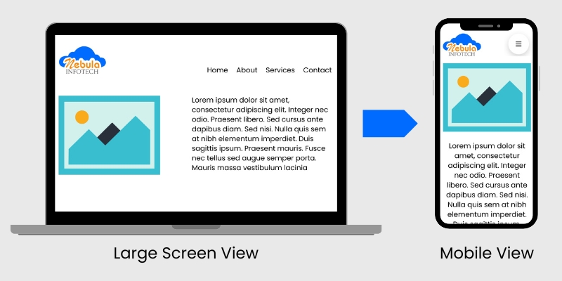
In the above picture, you can see a website on a larger screen with an image at the left and text at the right. On the mobile screen, all the elements adapt. The wide menu converts into a hamburger menu. Image and text are positioned one after one.
Why Responsive Website?
The Indian government websites had a poor reputation for being not responsive and user friendly but nowadays they are responsive too. The majority of designers use the mobile-first approach today.
Trust me there is no reason to leave your website nonresponsive but many reasons to make it responsive.
Being responsive is being responsible.
Let’s look at the benefits your website enjoys being responsive.
Improved User Experience
User experience is improved when a website layout and content are adaptive and users are able to navigate, read, and interact easily.
Users should not need to pinch or zoom. The text should be large enough and have enough spacing between lines for readability on each type of device.
Images should be 100% in width if they are larger than the device width.
Content should fit naturally horizontally and without a need to scroll. Buttons and links should be easy to tap on mobile devices.
Improved SEO
Google is the most widely used (around 90%) search engine and it prioritizes mobile-friendly websites in search rankings.
Although there are 200+ factors affecting search engine optimization or SEO. But responsiveness is one of the key factors.
I believe that the weightage of the responsiveness in the Google search algorithm will increase as the share of mobile users increases with time.
Higher Engagement & Conversions
A well-optimized mobile experience encourages users to stay longer. Better user experience increases conversions and revenue. Clear navigation and optimized CTA encourage users to take action.
Cost & Maintenance Efficiency
I have seen many news websites still using separate subdomains for mobile users like m.dailyhunt.in. This will certainly increase the cost of development, maintenance and resources.
Why not manage a single website with a responsive design, which will add no extra cost for a mobile website?
How to Make a Website Responsive
Technically speaking, the responsiveness of a website is achieved through CSS code with media queries. These queries handle all the CSS that works on the device with different screen sizes. It sets rules for screen resolution.
- @media only screen and (max-width: 768px) {
- @media only screen and (min-width: 768px) {
In the above examples, 1st one will follow the rules for 768px or smaller resolution and 2nd one for larger than 768px.
If you are not a technical person, you can use readymade themes with WordPress. Almost all WordPress themes come with auto-responsive features.
Future of Responsive Web Design
As technology advances, responsive web design will evolve. Smaller devices like smart wrist bands will have greater share in the internet world.
Developing countries like India are yet to fully opt for smartphones as 33% of mobile users use feature phones or basic phones, whereas the USA only has 7%.
Yes we can say for workstations, we need larger screens but other than that phones and other smaller devices will rock.
I am Sunil Tarwara, a seasoned IT professional with over 13 years of hands-on experience in Website Development and Digital Marketing. With a deep understanding of the challenges faced by businesses, I have been trusted by hundreds of clients to achieve their digital goals. I have Master’s degree in Information Technology.
Apart from websites, I like hill stations.